Plotting reference maps from shapefiles using ggplot2
16 Feb 2016 | web: Alan Pearse | github: apear9tags: ggplot2, r, visualisation, spatial |

This is about plotting reference maps from shapefiles using ggplot2. But it’s not just about plotting reference maps per se; it’s about plotting the reference map over some sort of raster or other data layer, like you would in a GIS application.
I will show you the ggplot2 approach and how it avoids the problems inherent in other approaches.
You need these packages: rgdal, sp, ggplot2
library(rgdal)    # to read in the shapefile
library(sp)       # for Spatial* classes and coordinate projections`
library(ggplot2)  # for visuallising the data`
To do what I have done with my data you will also need: gstat, dplyr
library(gstat)     # to support geostatistical stuff
library(dplyr)     # for aggregation of data
I start by loading in and kriging my non-map data which will form my raster layer. It’s a bit tedious and who cares so I will aim not to reveal the nuts and bolts of the process.
Since I’m using data that I derived from a publicly available AIMS data product, I’m obliged to do this:

Based on Australian Institute of Marine Science data
So now I have my raster layer, plotted using trellis graphics extended by the package sp. There is an output but no map to situate it.
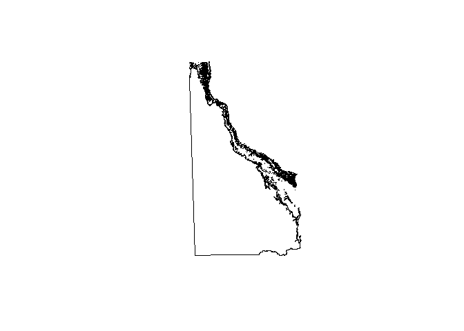
Now I’m going to get my reference map. It’s a shapefile from DeepReef.org which details all the geomorphic features of the Great Barrier Reef and contains a map of Queensland. How handy!
# This is why you need rgdal.
library(rgdal)

# Loading in the shapefile
GBR_feat <- readOGR(dsn = "C:/Users/Alan Pearse/Desktop/VRES/DATA_STRUCTURED/GEOGRAPHICAL_GEOLOGICAL/DeepReefOrg/Geomorphic_GBR/shape",
                    layer = "gbr_features",
                    verbose = F)

# Projecting to UTM Zone 55
GBR_feat <- spTransform(GBR_feat,
                        CRS("+proj=utm +zone=55 +datum=WGS84"))

# Plotting the thing
plot(GBR_feat)
Now, combining the two plots is problematic. I can’t just add one to the other, since spplot() is in the trellis family and plot() is in the base family. I wish they could just get along. :(
This is solution number 1: convert the kriging output to an actual raster and plot both the raster and the map using default plotting methods.
# Package raster to convert SpatialPixels into an image
library(raster)

# Converting
ras <- raster((kbin.dec.anis[,"var1.pred"]))

# Ew
plot(ras)

# More ew -- takes a while to compute, as well.
plot(GBR_feat, add = T)

This is awful. I’m sure I could improve it but the axis scales, the resolution, the colour scheme, the fact that the reference map is hollow – I can’t stand it. Some other method must be possible.
Solution number 2: use spplot to plot the reference map.
# This is how you'd do it. Hint: this is also how you wouldn't do it.
spplot(kbin.dec.anis, "var1.pred") +
spplot(GBR_feat)
It fails because of the way that spplot() handles its arguments.
So base plot sucks and trellis plot doesn’t work. Where do we turn now? Or, rather, where should we have turned in the first place? To ggplot2, of course!
Although the shapefile is not initially suitable for plotting in ggplot, ggplot2 has fortify() which handles a whole range of objects (e.g. linear models) to make them suitable for plotting. A shapefile read in as a SpatialPolygonsDataFrame is no exception.
# The all important ggplot2
library(ggplot2)

# Optional: colour brewer for colour scales
library(RColorBrewer)

# Preparing to plot it using fortify()
GBR_feat <- fortify(GBR_feat)

# Actually plotting
ggplot(data = as.data.frame(kbin.dec.anis),
       aes(x = Var1,
           y = Var2)) +
  geom_raster(aes(fill = var1.pred)) +
  scale_fill_gradientn(colours = rev(brewer.pal(11,"RdGy"))) +
  geom_polygon(data = GBR_feat,
               aes(group = group,
                   x = long,
                   y = lat),
               fill = "darkblue") +
  theme_minimal() +
  xlim(0,1500000) +
  ylim(-3250000, -800000) +
  coord_fixed(ratio = 1) +
  labs(x = "Eastings (UTM Z55)",
       y = "Northings (UTM Z55)",
       title = "Water temperature\nin December",
       fill = "Temperature\n(degrees Celsius)")
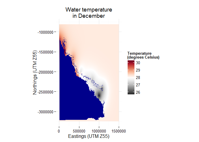
It works! And it even looks good. The best thing about it is that ggplot2 kind of works like a GIS application. You can layer plots in whatever order you wish, simply using the "+". It is ideal for handling this kind of stuff.
One word of warning though: be careful about using xlim() and ylim(). For some reason they act like subset() functions which can mess up the polygon definition if you set either to be so small as to cut out part of the reference map.